In contrast to the color predictions of the last two years, 2018 colors tend to be moodier, more introspective hues. There are a few exceptions; take a look at the round-up below.
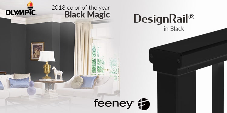
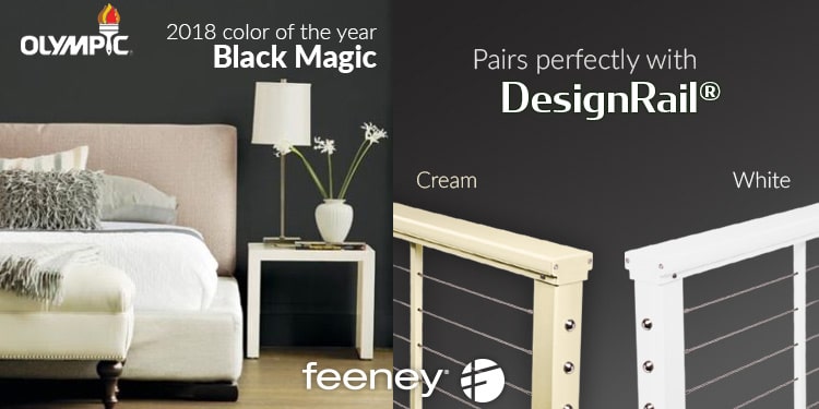
Olympic: Black Magic
In a bold move, Olympic describes its 2018 color pick as “a color that embodies glamour and strength”. And indeed, this dark neutral color will create a strong statement. Dee Schlotter, PPG Senior Color Marketing Manager says, “… in the current day, consumers often feel uneasy, restless or like their privacy is being invaded, so they crave deep, comforting colors that offer a welcomed escape from the chaos of daily life”
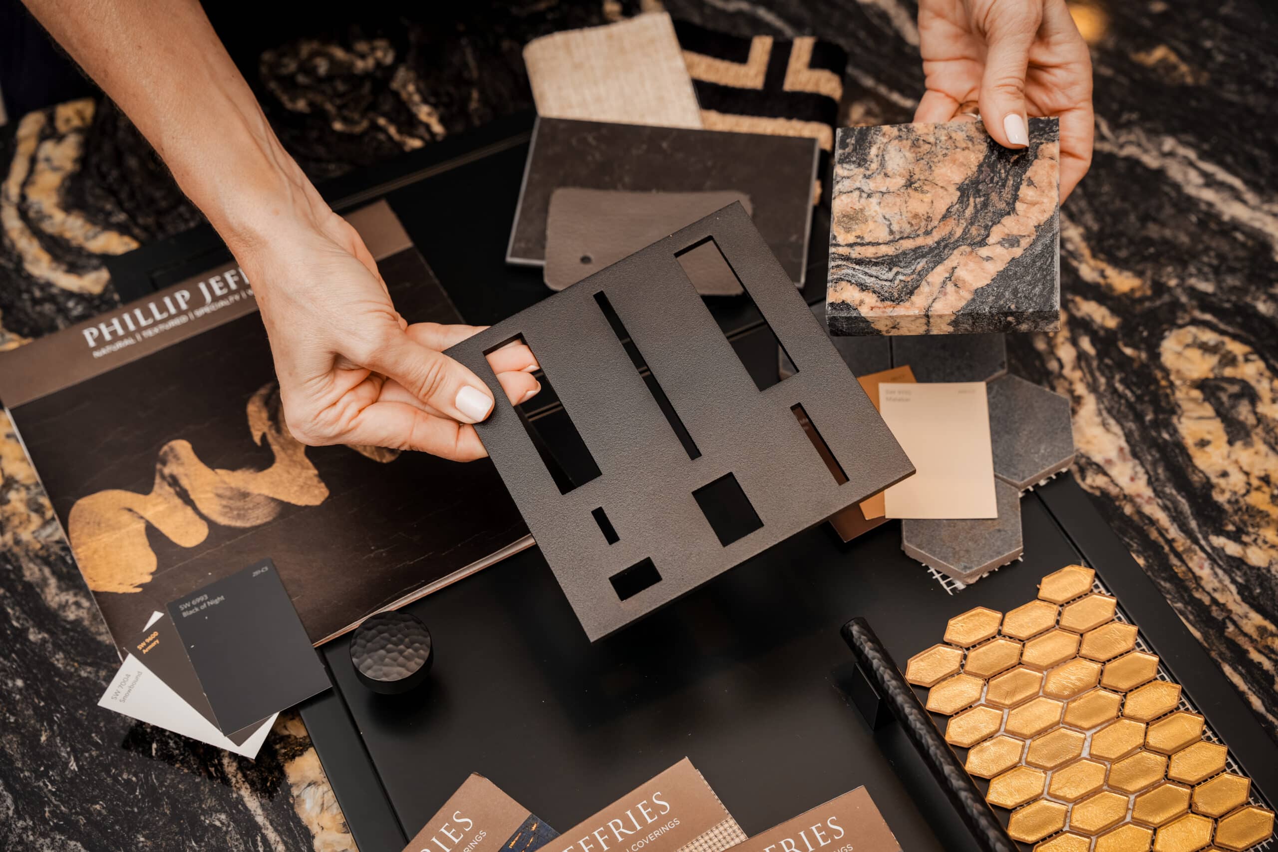
Black Magic is a warmer black that can easily be integrated into your home’s existing color scheme. It also pairs nicely with any DesignRail® railing color choice. Here we have chosen to show our lightest choices: cream and white.
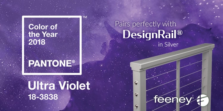
Pantone: Ultra-Violet
“Inventive and imaginative, Ultra Violet lights the way to what is yet to come.” – so say the color gurus at Pantone, the world-renowned authority on color and provider of color systems. Pantone has long been known worldwide as the standard language for color communication from design to production, across a variety of industries.
Inspired by rock legends (Prince and Jimi Hendrix) and mystic origins, Ultra-Violet speaks more to what is possible, or what is needed, rather than what is. Pantone hopes to energize and inspire with its bold color choice.
You can custom order a purple DesignRail® railing, OR you can pair Ultra-violet with silver for a sparkly combination.
Sherwin-Williams: Oceanside
“A collision of rich blue with jewel-toned green, a color that is both accessible and elusive” is how Sherwin-Williams describes its color choice for 2018. A deep, complex color that make a bold statement in any room, Oceanside both reassures and envelopes you in a warm watery embrace. Whether you have mid-century modern or Mediterranean style, Oceanside is the wow color that’s easy to live with.
Inspired by Sherwin-Williams example room, we have paired Oceanside with DesignRail® in Green and Not A Mellow Yellow, although it also works well with any neutral.

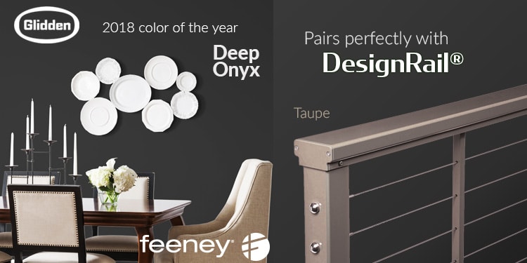
Glidden: Deep Onyx
Another black makes the 2018 colors of the year list, and this one means business: “it’s time to stop getting caught up in a fantasy and bring it back to the basics with the most forgotten neutral – black.” A return to less is more, it works as both a main color and an accent color.
You can use this accent on your next railing, with DesignRail® in black. Or you may also pair Deep Onyx with one of our standard colors. Here we have used Taupe as a contrasting neutral shade with a touch of warmth.

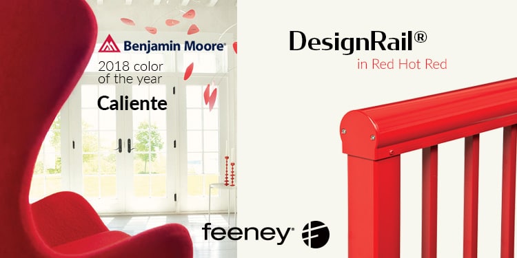
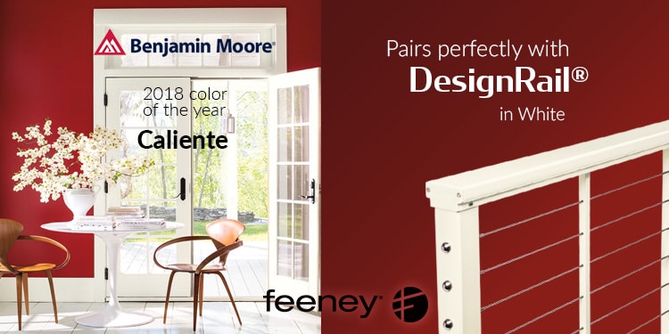
Benjamin Moore: Caliente
Benjamin-Moore’s color of the year is red hot, but cool enough to ground a room. Caliente is a deep red, powerful enough to stand on its own, but balanced enough to complement other, cooler colors. “Caliente is the signature color of a modern architectural masterpiece,” says the company.
Caliente pairs perfectly with DesignRail® in crisp white, but also plays nicely with silver, gray, or black. For a brighter alternative, see our Express Yourself color Red Hot Red.
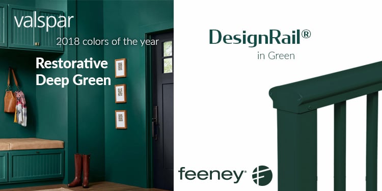
Valspar: Restorative Deep Green
Valspar wouldn’t limit themselves to just one color for 2018, but instead offer a palette of colors ranging from deep hues to dusky lighter shades. We were most intrigued by Restorative Deep Green, which promises to soothe and invigorate. Valspar weaves a story around this shade: “We’re explorers, not tourists, who seek meaning in the experiences we collect at home and away.”
This color matches our standard green DesignRail®. It also pairs nicely with black or taupe.
See all colors in Valspar’s 2018 palette

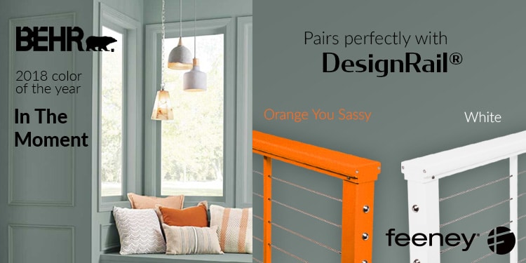
Behr: In The Moment
In contrast to other brands, Behr has chosen a cool, tranquil color that hovers on the border between grayish-green and a grayish-blue: In The Moment. This relaxing neutral shade is well suited for indoor or outdoors, and is designed to evoke a sense of sanctuary in our busy, modern world.
Inspired by their signature photo, we have paired In The Moment with our bold Orange You Sassy (one of our Express Yourself line of colors) and a calm, cool white.
See the entire palette of 20 colors from Behr
Kelly-Moore: Bahia Grass
Kelly Moore also threw their weight behind a lighter shade: Bahia Grass. This delicate sea-gray-green is a true modern neutral with a 70s influence. It evokes the image of swaying grasses in a summer breeze, but works well in any season.
Here we are pairing Bahia Grass with our DesignRail® in Cream for a calming, soothing experience.
See Kelly-Moore’s complete palette of 2018 colors